Telecommunications & Enterprise Technology
Verizon Asset Library Kit - Turning B2B Complexity into Clarity
OVERVIEW
Verizon Business needed a clearer way to communicate complex enterprise services across B2B touchpoints. The 2D asset library used abstract forms, directional gradients, and Verizon’s red and yellow palette to turn technical ideas into clear and recognisable visuals. The result is a scalable system that supports stronger clarity and brand recognition across marketing and digital communications.
Role
Scope
Never Sit Still
Producer:
Britta Fehn-Jeffery
Creative Director:
Zoe Crocker
Project Lead:
Howe Tom
2D Design:
Mulanne Phan
Howe Tom
Claudia Novelia
2025
Client
Verizon
Agency
Turner Duckworth
2D Asset Design, Visual System, Digital Brand Assets, B2B Visual Communication
2D Design
Timeline
Team

PROBLEM
Enterprise services are complex to explain and easy to make look generic
Business Customers
“I need to quickly understand how this service helps my business stay secure and running smoothly.”
Make the Value Immediate
Audiences needed to quickly understand what Verizon Business services help them do, from staying connected to protecting operations and supporting growth
Built for Motion
The assets needed to work as static graphics first, while being built with motion logic in mind
Marketing & Sales Team
“We need flexible assets that can explain different services across decks, campaigns, digital touchpoints, and future motion.”
Business Decision-Makers
“I need to understand what the service helps my business do, why it matters, and why it is worth investing in.”

DESIGN CHALLENGE
How do we turn complex enterprise services into a visual system Verizon could own?
Keep 2D & 3D Aligned
The 2D assets had to explain ideas clearly without fighting the 3D visuals, creating a lighter layer that could support the wider Verizon Business asset library
STRATEGY & POSITIONING
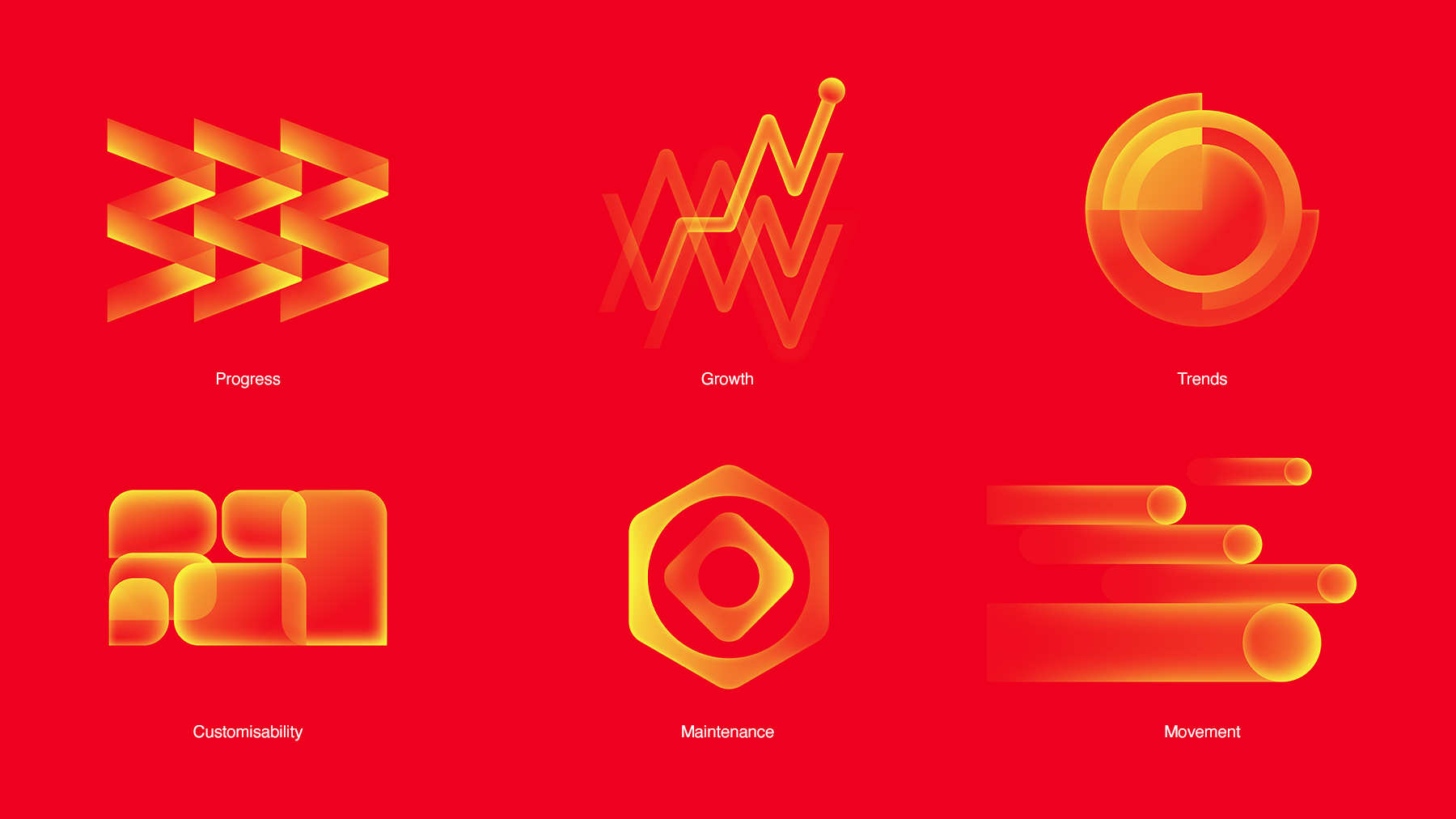
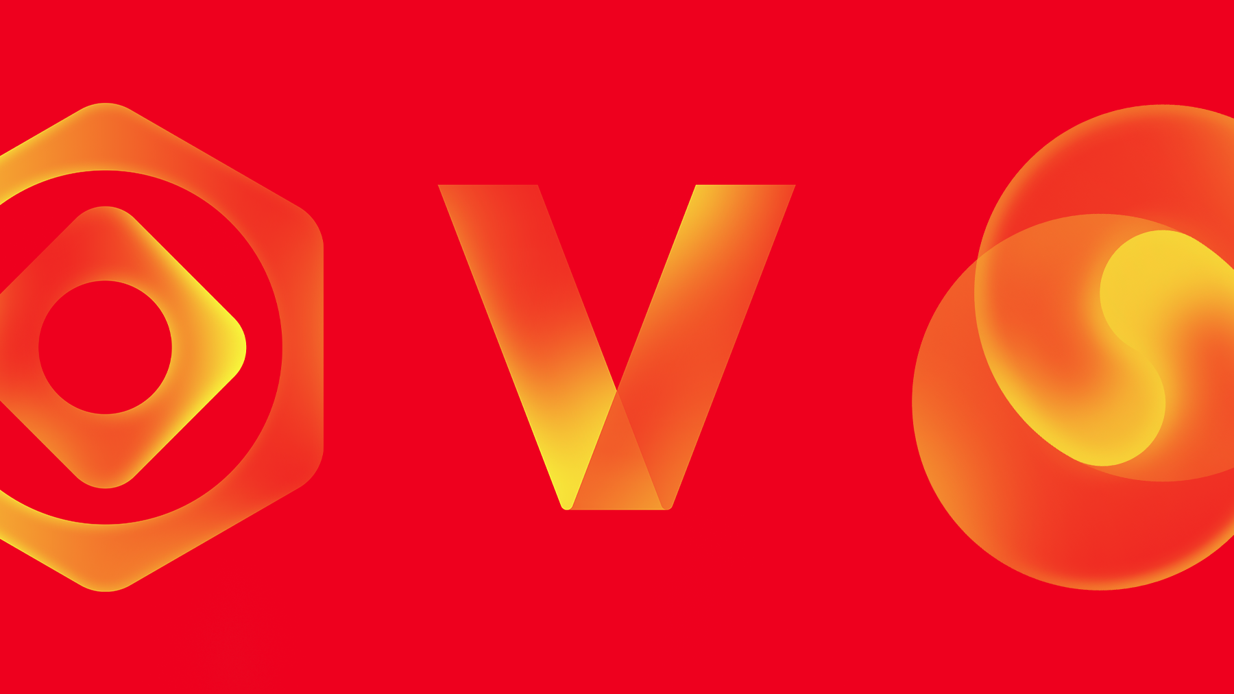
Signal Made Visible
Directional Gradients
Custom gradients were adjusted for each asset to guide the eye, define the form, and suggest movement before animation
Abstract Clarity
Turns invisible enterprise services like connectivity, speed, security, and progress into clear visual forms
Motion-Ready System
Layered forms and directional paths gave each asset a natural motion logic for future animation
RESULT & TAKEAWAY
A scalable 2D asset system that helped Verizon Business communicate complex services with clarity and brand recognition across marketing and digital touchpoints
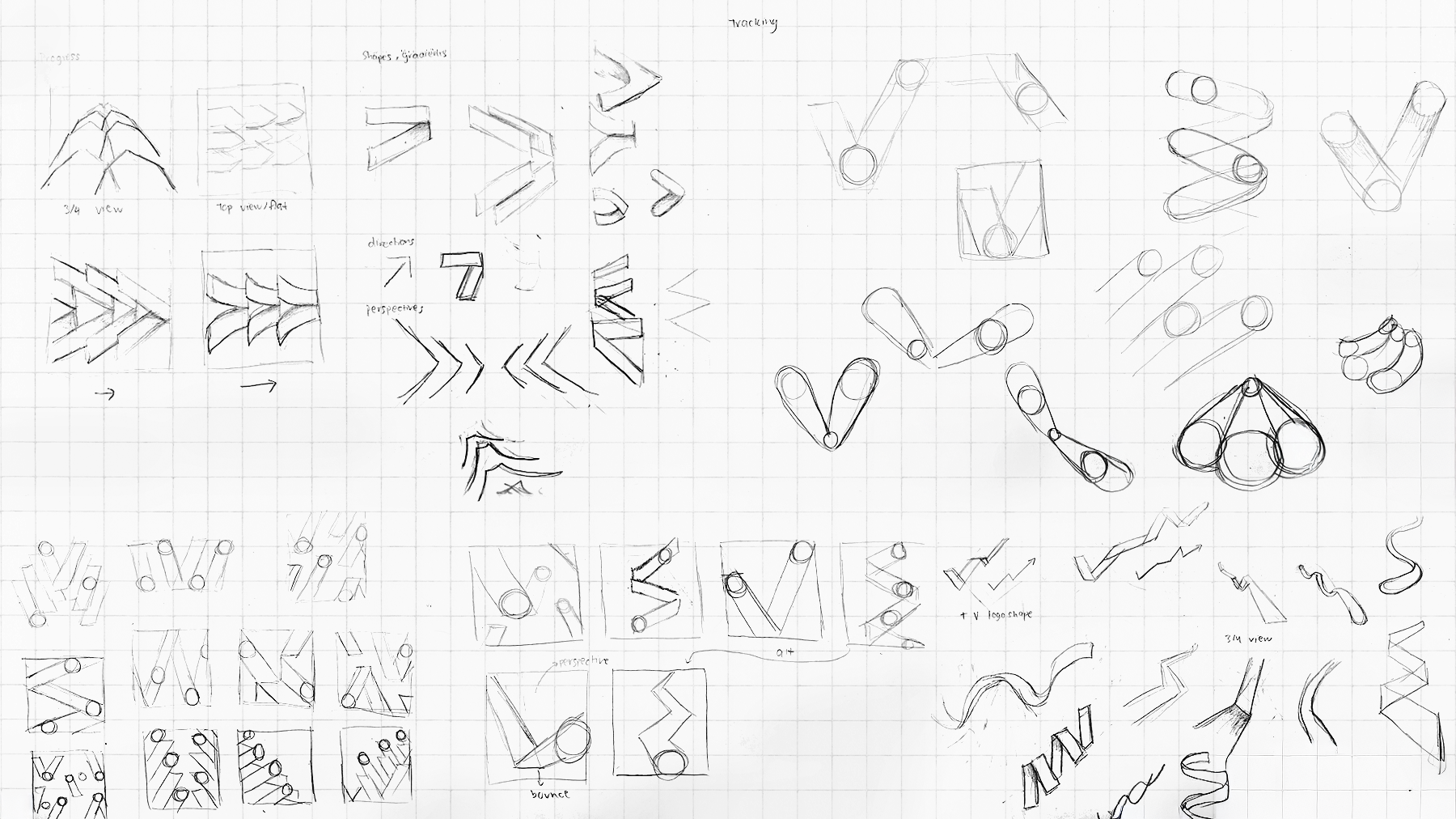
Designing Static Assets for Motion
Even though the first rollout was static, each asset needed a clear motion logic. Directional gradients and visual flow helped create assets that could later animate naturally across digital and motion applications
Balancing 2D & 3D
The 2D system needed to support the wider asset library without competing with the 3D visuals. The forms were kept lighter and simpler, while gradients and overlap added enough depth to feel dimensional without becoming fully 3D
Clarity Through Abstraction
The biggest learning was finding the right level of abstraction, simple forms made each asset easy to read, while overlaps and directional gradients added enough detail to suggest more complex ideas