Productivity App
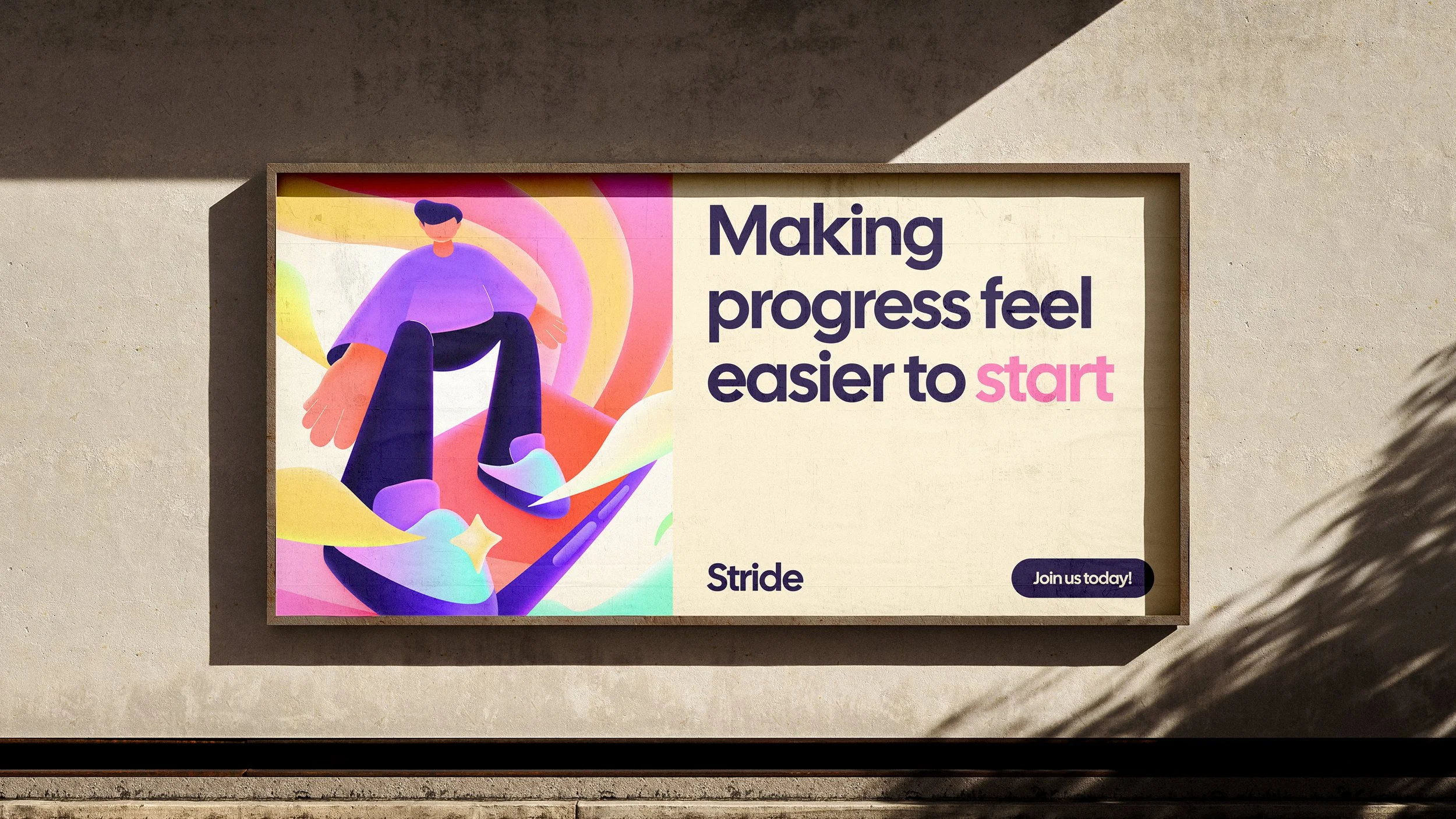
Stride - Making Progress Feel Easier to Start
OVERVIEW
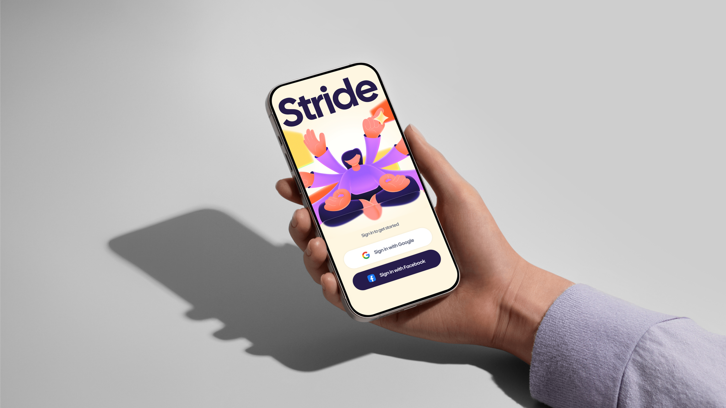
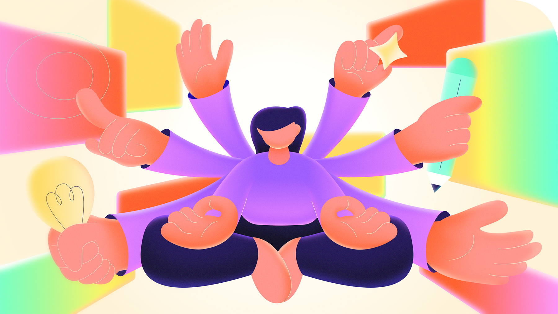
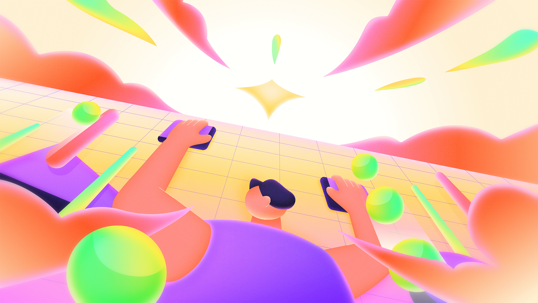
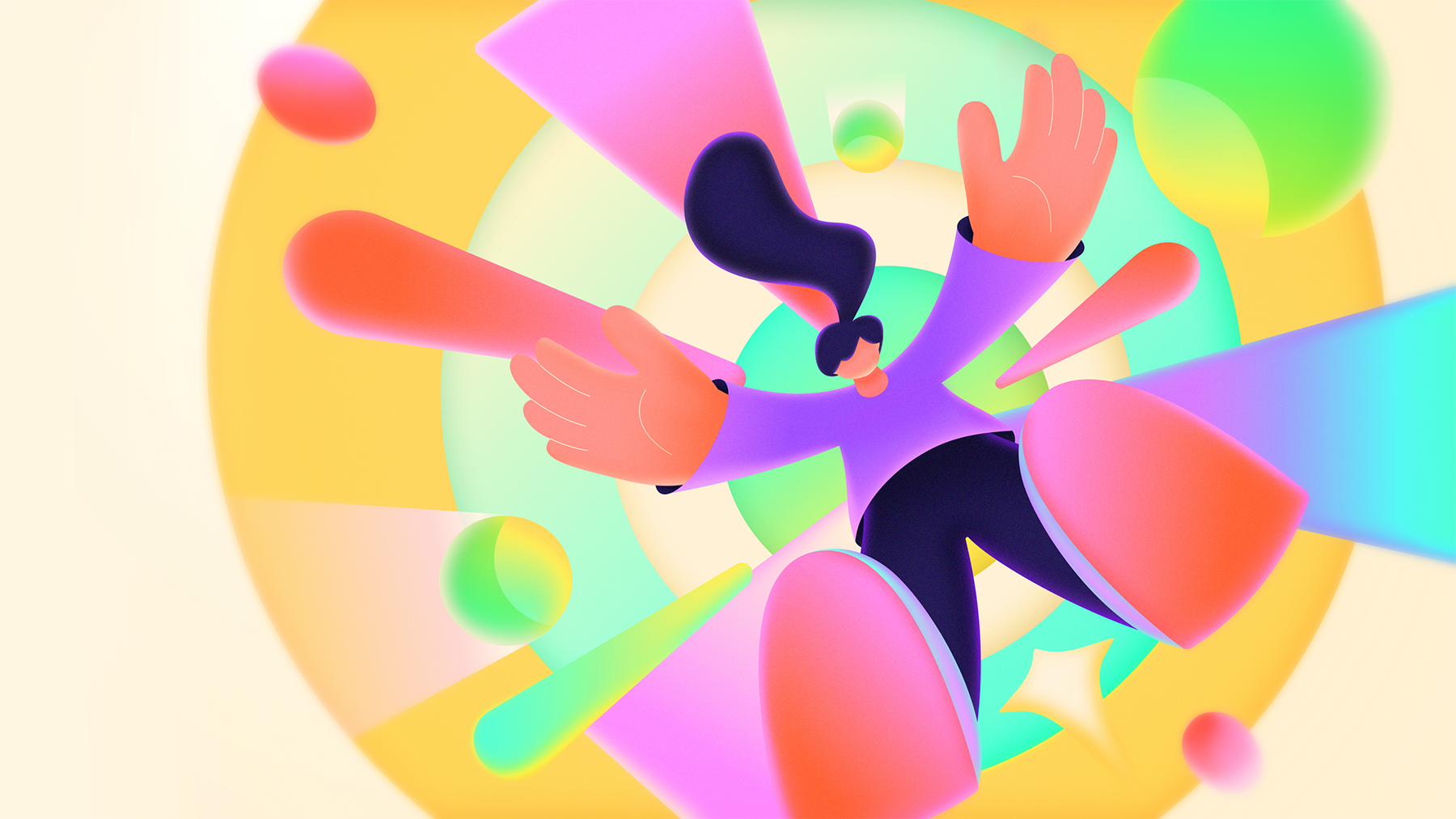
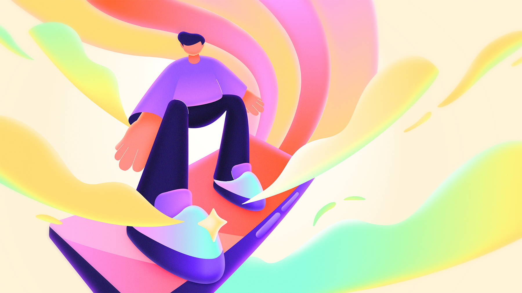
A set of illustrations and styleframe designs for Stride, a productivity app created to help users feel more organized and move through their goals with clarity. The project responds to the problem of scattered tasks and ideas, which can make focus harder to maintain. The visual direction uses shifting perspectives and intentional color choices to create depth and guide attention. The outcome is a purposeful sequence that shows how organization can make progress feel clearer and easier to act on.
Role
Scope
Personal Project
2025
Product Storytelling, Visual Direction, Motion Styleframes, Digital Product Assets
Illustrator
Timeline
Team
PROBLEM
Scattered tasks make progress harder to start
Users
“I know what I need to do, but everything feels spread across too many thoughts, tabs, and reminders.”
Marketing Team
“The visuals need to make focus feel clear, active, and easy to understand in a few seconds.”
Product Team
“The app needs to feel useful quickly, without relying on a long feature explanation.”
DESIGN CHALLENGE
The visual direction had to make organisation feel less rigid and more motivating, helping progress feel clear from the first glance
Reduce Friction
Turn scattered information into a clear starting point
Stay Readable
Keep the system energetic without making the product feel overwhelming
Create Momentum
Use movement, perspective, and rhythm to make progress feel active
STRATEGY & POSITIONING
Focus That Moves with You
Flow
Curved shapes and soft transitions give the illustrations a sense of ease, making productivity feel flexible instead of rigid or overwhelming
Clarity
Intentional colour shifts guide the eye toward the main focus of each frame, helping the sequence stay clear even when multiple actions happen at once
Momentum
Visual cues of climbing, reaching, flowing, and multitasking turn abstract productivity into a more active story about movement, focus, and getting into a creative flow

RESULT & TAKEAWAY
Stride’s illustration system helps users understand the app’s value faster, giving the brand a distinctive visual language for launch and UI touchpoints
Making Productivity Feel Lighter
The illustrations avoid the usual heavy task-management look by using space, flow, and colour to make organisation feel easier to approach
Turning Focus into Motion
Bold typography and natural colours gave the brand confidence while keeping it grounded and approachable
Designing for Fast Attention
Each illustration works as a quick hook, making the system adaptable for different contexts: launch assets, social content, and motion-led storytelling